
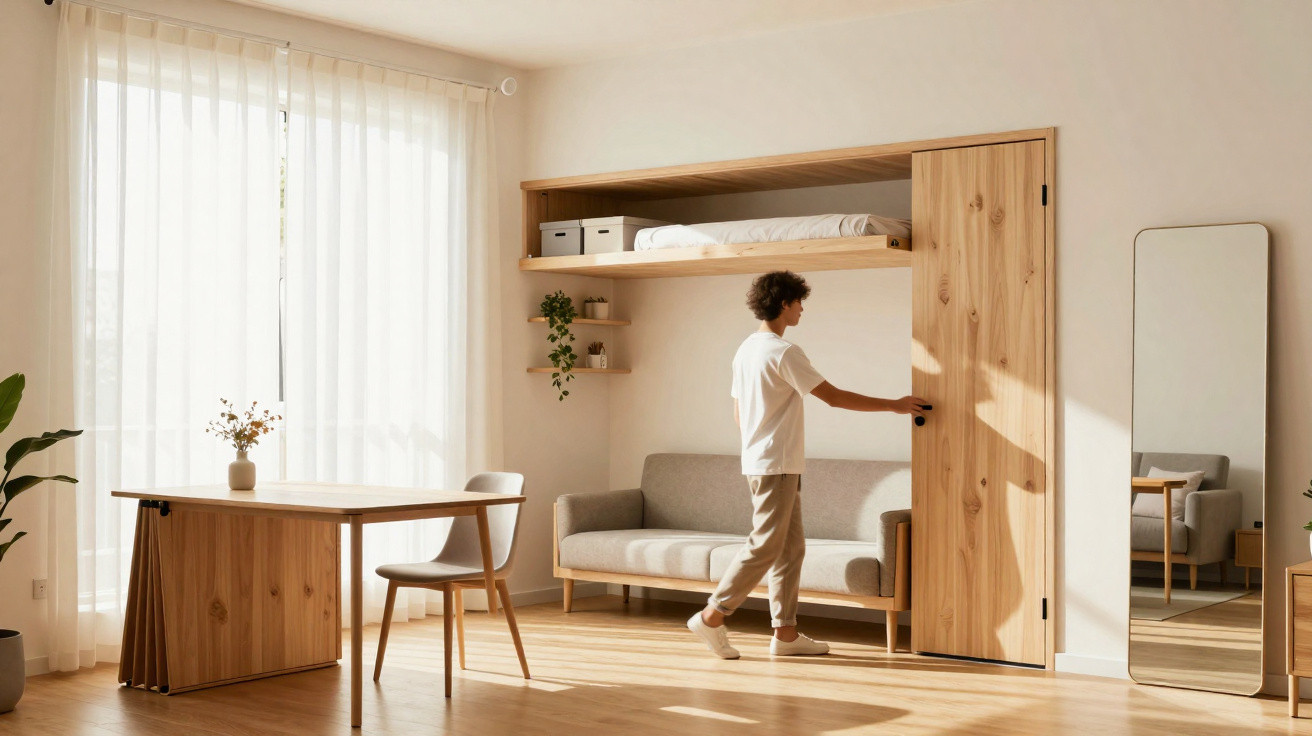
On a Sunday evening in a 20 m² studio flat, a bag left on the floor and a chair moved out of place can be enough to make the walls feel as though they are closing in. The table has to accommodate dinner, working from home and forgotten bills, while the bed remains in view, constantly reminding you that the room cannot serve several lives at once. We all know that moment of looking around a small home and wondering how other people manage to fit in a proper entrance area, dining spot and even a bookcase. Interior designers do not magically extend the walls: they work with light, sightlines and everyday habits. Their techniques can genuinely transform daily life, without necessarily starting a daunting renovation. Everything comes down to the details.
The first three ways to free up space straight away
The first tip is to define areas without boxing them in. In a studio flat, a solid partition blocks light and shortens the view, even if it is only a few centimetres thick. A rug beneath the sofa, a pendant light above the table or a subtle colour change on one section of wall can be enough to establish living, dining and sleeping zones. The eye then understands how the home is arranged without coming up against a barrier. This feeling matters enormously: a flat appears larger when every activity has its own place, without the room being divided up like a Tube map.
The second instinct is to make use of height, which is often overlooked when life is organised at floor level. In a 20 m² Paris studio refurbished last year, an interior designer had slim shelves installed across an entire wall, reaching to within 30 centimetres of the ceiling. Books, boxes and less frequently used belongings were removed from low-level furniture, leaving almost nothing protruding across the floor. The benefit was not simply extra storage: the room seemed able to breathe. A vertical bookcase naturally draws the gaze upwards and makes the ceiling feel further away. In compact homes, every square metre matters, but so does every metre of height.
The third technique sounds simple, perhaps even overly so: select furniture that keeps the floor in view. A sofa with slender legs, a floating console table, lightweight chairs or a slightly raised bed allow the eye to travel rather than stopping it. Large units sitting directly on wooden flooring visually consume the room, however useful they may be. Seeing more of the floor makes us perceive a larger room; that is simply how our brains work, whether we think about it or not. Let us be honest: no one measures the visible space beneath a piece of furniture every day. Even so, it is one of the most effective considerations when buying something new.
Four interior designer tips for turning constraints into strengths
The fourth move is to favour furniture that can take on another role, without turning the home into a gadget shop. A drop-leaf table fixed near a window can act as a desk in the morning and a dining area in the evening; a storage bench can seat guests while concealing household linen. The aim is not to collect folding solutions, which are often flimsy or uncomfortable, but to remove single-purpose furniture. Before making a purchase, one question is especially useful: “Does this object do at least two jobs?” If the answer is no, it may be better left in the shop. That kind of selection takes a little self-control, particularly when faced with an attractive little occasional table.
The fifth tip lies in the colour palette, avoiding the clinical all-white trap. Pale walls remain a reassuring starting point because they reflect natural light, yet a deeper shade can make a room feel larger when used in the right place. Painting the back wall in a greyed beige, soft sage green or smoky blue creates depth, as though the room continues beyond it. The ceiling can remain a slightly lighter tone to preserve an airy feel. A common mistake is applying several bright colours to every wall: the studio then becomes lively, but also visually restless. One carefully positioned colour says more about the space than four scattered accents.
The sixth tip involves mirrors, provided they are used as imagined windows rather than as automatic decoration. Positioned opposite an opening or at right angles to it, a large mirror reflects light and extends the view outwards.
“In a small space, a mirror should not merely reflect a person: it should reflect depth or a source of light,” interior designer Claire Delorme points out.
A few guidelines help prevent a dance-studio effect:
- choose a vertical format to emphasise height;
- direct it towards a window, lamp or uncluttered wall;
- avoid accumulating small mirrors with no clear purpose.
One large, well-placed mirror achieves more than an entire collection.
The seventh tip is less photogenic, but it makes all the difference: organise storage according to how often items are used. Everyday belongings should be within arm’s reach, whereas suitcases, paperwork worth keeping and occasional appliances can be stored higher up or slipped beneath the bed. A studio quickly feels too small when it becomes a warehouse for everything without a defined home. Interior designers refer to closed storage as a way of calming the eye: smooth doors, matching baskets or a lightweight curtain across an alcove. Visual clutter is more tiring than a lack of square metres. This is not a lesson in perfection, merely a way to regain a room you want to come home to.
A studio that feels bigger in your mind and in everyday life
Making a 20 m² studio feel twice as large does not mean living in an empty setting, or giving up keepsakes, plants or the armchair you genuinely love reading in. Instead, it is about deciding what you want to feel when you open the door: calm, light, a sense of movement, perhaps even a little pride. The best small interiors rarely look as if they were measured down to the millimetre, although they often have been. They retain signs of real life: a throw spilling over the edge, a book on the table, a mug by the window. Space is not only a matter of floor area. It is also about breathing room, movement and the habits we are willing to rethink.
| Key point | Detail | Added value for the reader |
|---|---|---|
| Create zones without partitions | Rugs, lighting and colours define uses without blocking the light. | The studio feels better organised and movement becomes more fluid. |
| Make height work harder | High shelves, wall storage and furniture on legs clear the floor. | The eye is drawn upwards, the room appears larger and belongings find their place. |
| Reduce visual noise | Multi-purpose furniture, closed storage and a well-positioned mirror simplify the room. | A brighter, calmer and noticeably more pleasant home to live in. |

Comments
No comments yet. Be the first to comment!
Leave a Comment