
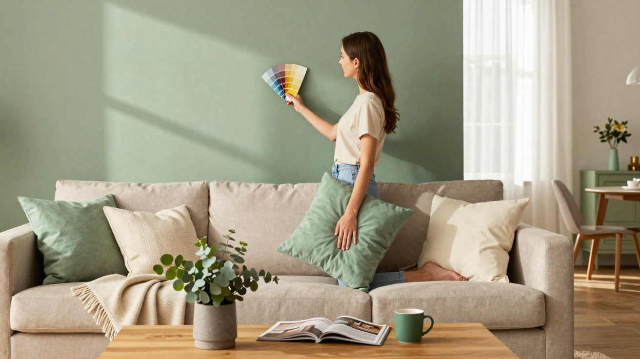
Interior designers, Pinterest boards and furniture retailers are all sending the same message right now: neutral shades are here to stay, but they are facing competition from a hue that suggests nature, calm and understated luxury. Anyone looking to make their home feel modern, restful and full of character can hardly overlook it.
Why muted sage green is in such demand right now
At the heart of this trend is a shade already familiar to many from design magazines: sage green. It is a soft, subtly powdery green with a grey undertone, reminiscent of the leaves of the sage plant. Rather than a vivid splash of colour, it acts as a kind of “relaxation filter” for walls, furniture and accessories.
“Sage green feels like fresh air for a room – noticeable, but never loud.”
The colour is perfectly suited to a time when flats and houses are expected to be more than simply a backdrop. More people are working from home, spending more evenings in their own living rooms and seeking a retreat rather than constant stimulation. As a result, the desire for peaceful, soothing colours is growing.
Sage green conveys exactly that feeling. It brings herbs, woodland, gardens and spring to mind without looking overly rustic or country-style. The shade is urban enough for a loft or new-build flat, while still being warm enough for a period property or terraced house.
The key benefits of sage green at a glance
- A calming effect: Green shades are generally considered relaxing. Sage green softens the intensity of traditional greens and creates a tranquil, almost meditative atmosphere.
- Timeless rather than a passing fad: Unlike loud trend colours, this shade remains understated. It will still look right in three or four years and will not need repainting straight away.
- Exceptionally easy to combine: Sage green works with wood, black, white, beige, terracotta, brass and concrete, making it suitable for Scandinavian, minimalist, boho and classic interiors.
- More character than white and beige: Those who like neutral rooms but want to add more depth can embrace colour with this shade without immediately choosing colourful wallpaper.
Bringing the new trend colour into your home
Many people hesitate to make colour changes because they immediately picture a full makeover. That is not necessary at all. Sage green can be introduced in a very measured way – or used more boldly if you are ready for a change.
A statement wall instead of painting every wall
The easiest way to begin is with a single feature wall. Try the area behind the sofa, the section of wall by the dining table or the wall behind the bed. This gives the room depth without making it feel dark.
In a bedroom, a sage-green headboard wall creates a calm, subtly hotel-like atmosphere. In a living room, a coloured wall can redirect attention – away from the television and towards a picture, shelving unit or sideboard.
Wallpaper: the shortcut to an “interior designer look”
Rather than reaching for a paint tin and roller, many people are turning to wallpaper again. Modern designs have little in common with the heavy patterns of previous decades. Sage green in particular is available in elegant versions with linen textures, graphic lines or subtle floral motifs.
A textured sage-green wallpaper can:
- give structure to an otherwise dull hallway;
- act as a backdrop for the table and chairs behind a dining table;
- create a cosy, “enclosed” feel in small rooms.
If you are unsure, begin with a single drop as a vertical strip, assess the effect and add more if you like it. Many modern wallpapers are relatively easy to remove, making them ideal for rented homes or anyone who enjoys changing their décor.
Accessories: the low-risk option for the cautious
Anyone who finds the idea of painting walls too daring can work with textiles and decorative pieces instead. Sage green works particularly well as an accent colour:
- cushions and throws on a pale sofa
- curtains combined with white walls and light wood
- bedding or a bedspread in the bedroom
- vases, candleholders, picture frames or ceramics on shelves
The advantage is that everything can be swapped easily if your taste changes.
Sage-green furniture – for the style-conscious and bold
For a more pronounced approach, introduce the trend colour through larger pieces of furniture. Particularly popular choices at the moment include:
- sideboards with matt sage-green fronts
- sage-green kitchen base units paired with a light worktop
- dining chairs upholstered or painted in the trend shade
- small side tables or chests of drawers
Paired with oak, beech or ash, the shade feels natural and warm. Combined with black metal or concrete, it takes on a contemporary, almost architectural quality.
Unexpected places: the hallway, bathroom and utility room
The effect becomes especially interesting in places where colour is rarely expected. A small hallway with a sage-green wall and good lighting instantly feels more refined. A cloakroom with sage-green wallpaper and gold-coloured fittings has the air of a boutique hotel. Even an unremarkable utility room can feel considerably more homely with a sage-green cupboard and a few baskets.
The best colour combinations with sage green
The appeal of this colour lies in its adaptability. A few combinations stand out in particular:
| Combination | Effect in the room |
|---|---|
| Sage green + off-white + beige | very light, calm, ideal for bedrooms and living rooms |
| Sage green + light grey + anthracite | modern, crisp, well suited to home offices and city flats |
| Sage green + terracotta + earth tones | warm, homely, works well with plants and wood |
| Sage green + brass/gold | elegant, slightly glamorous, ideal for hallways and dining areas |
| Sage green + deep navy blue | expressive, sophisticated, works in large rooms |
“The balance of surface areas is crucial: sage green tolerates companions – in fact, it needs them to feel alive.”
Common mistakes with the trend colour – and how to avoid them
Although the shade is easy to use, there are still a few potential pitfalls.
- Ignoring the light: In very dark rooms, an overly muted sage green can quickly look cold or flat. Choose lighter versions here and use warm lighting.
- Mixing too many different greens: A sage-green rug, emerald-green cushions and forest-green curtains can soon feel unsettled. Define one or two green shades clearly and keep everything else neutral.
- Covering everything in sage green: If the walls, sofa, rug and curtains all share the same shade, there is no contrast. A better approach is to use sage green as the base, then add wood, cream, black or metal.
How to find the right shade for your own room
Not all sage greens are the same. Some versions lean more strongly towards grey, others are warmer and slightly yellow-toned, while others are almost pastel. To avoid the room looking entirely different from what you expected, use test samples.
- Place test strips generously at eye level
- Look at them over several days in daylight and under artificial light in the evening
- Hold them against existing furniture, flooring and textiles
This will quickly reveal whether the shade is too cold, too dark or exactly right.
How sage green can transform your interior style
Those coming from a very cool, grey-heavy interior style can use sage green to introduce more warmth and natural character without having to replace everything. A grey sofa immediately looks less severe with sage-green cushions. A white dining table with matching chairs in the trend colour moves away from an office-like feel towards a “cosy dinner with friends”.
There is also an interesting psychological aspect: many people report that they automatically associate sage-green rooms with order and calm. This can encourage them to keep surfaces clearer, choose decorations more consciously and leave less clutter lying around. The colour therefore becomes a small everyday coaching tool.


Comments
No comments yet. Be the first to comment!
Leave a Comment